Design psychology [Updated]
Sep 12, 2024
✦
Design
These are notes of my observations and learnings from different sources, I will use this space for revisions and saving good hacks:
Banner blindness:
Users ignore things they get repeatedly exposed to. It's like the more they see you, the more you lose your presence.
Especially when their attention is already captured by something else.
For example: Daily reminders, notifications or Important information at ADs location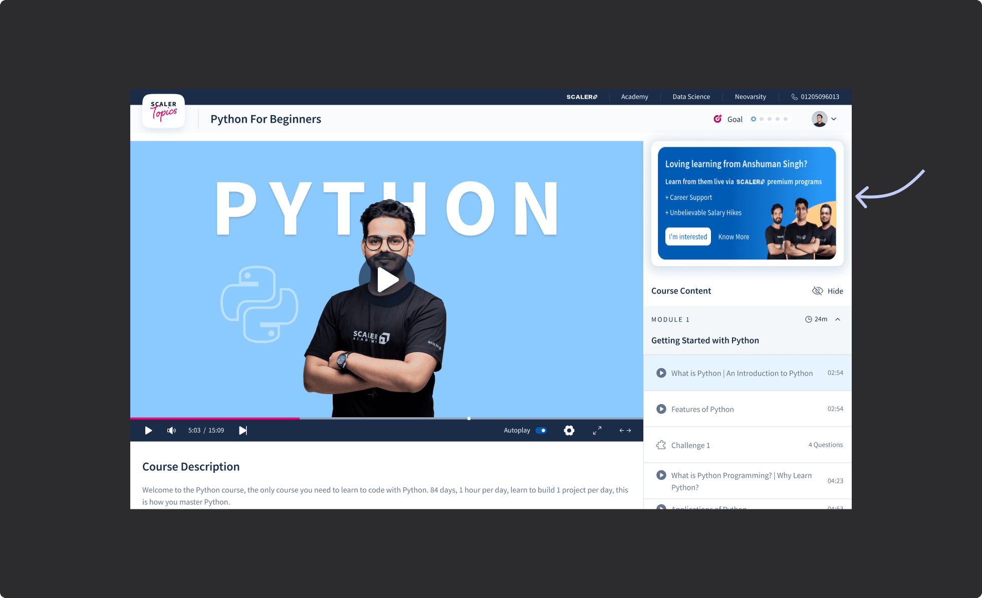
Friction:
Add friction when you want users to make informed decisions. Generally, we want users to make decisions effortlessly and quickly, but sometimes it will cost a hell lot of work for our customer support team.
That's why we add friction in some areas where the impact of specific actions would be so big and we don't want users to take those actions by mistake.
For example: Delete account action, Swipe to pay, Solve puzzle to turn off the alarm.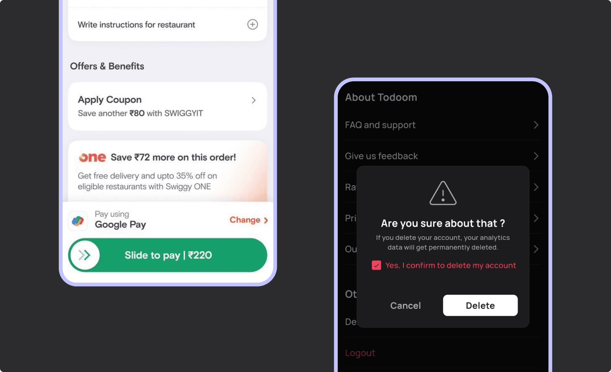
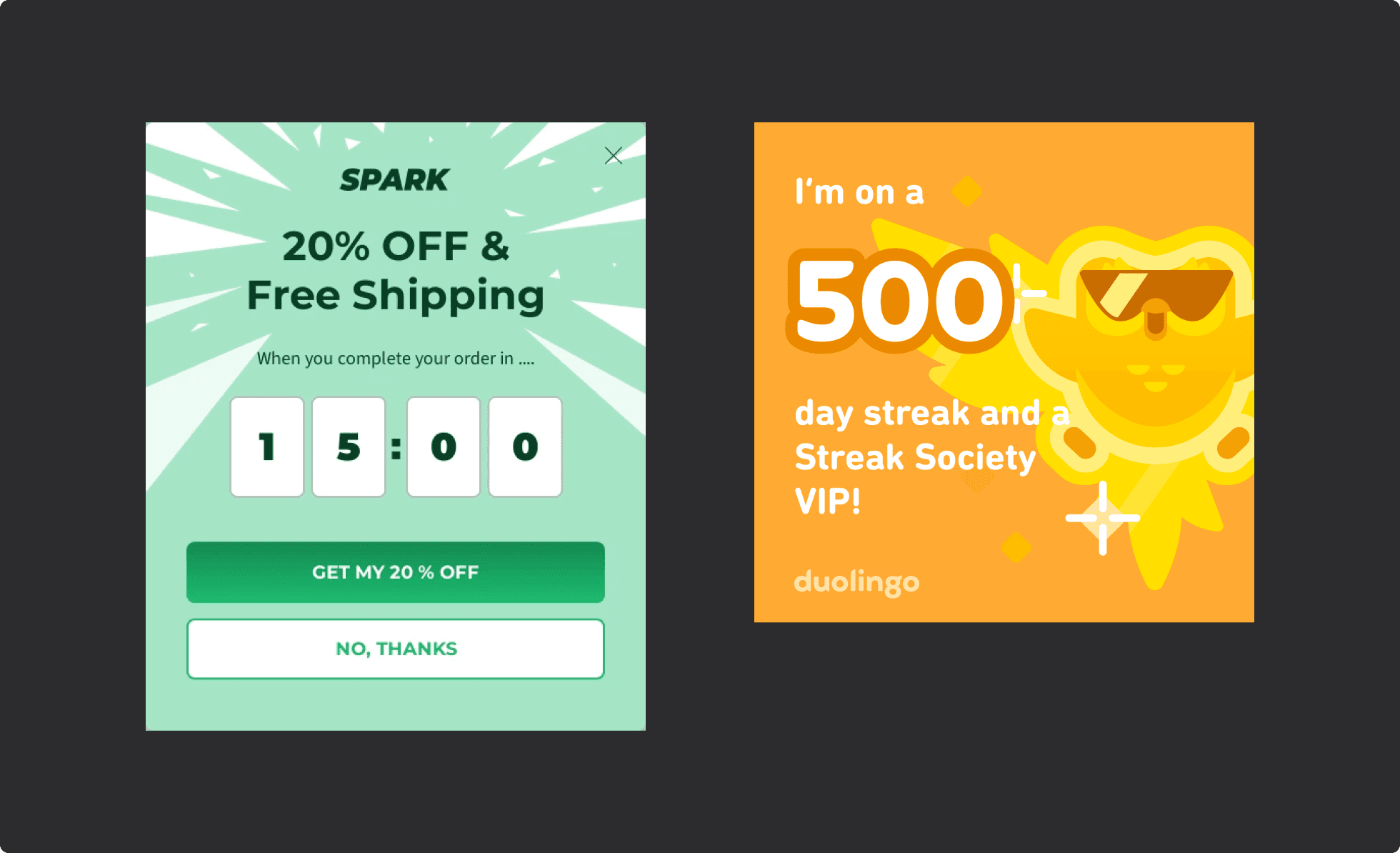
Loss aversion:
People don't like to lose what they already got. Mostly, it is used to improve active engagement or quick purchase.
For example: streaks, discounts with a time limit.
Usecase of illustrations/icons:
Users tend not to take unfamiliar actions, usually they revert back when they don't know exactly what will happen.
That's when icons/illustrations helps users analyze possible outcomes.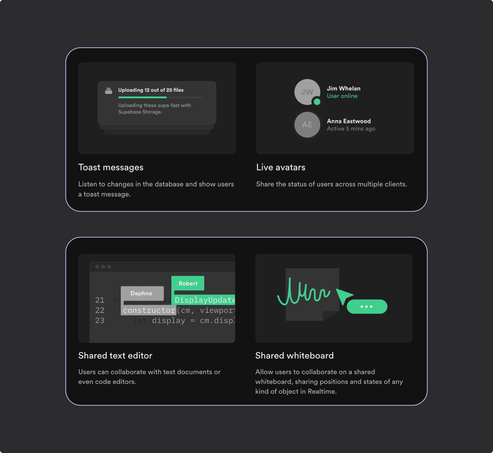
The importance of story telling:
Humans are naturally emotional, and our brains are wired to capture and remember stories. Through stories, people can empathize, think, and connect with our brand. Our brains become more engaged when we hear stories, making them more memorable.
Example: I often forget the name “2586 Studios” because numbers are hard for my brain to remember. But thanks to their story in the footer, I always remember the brand.
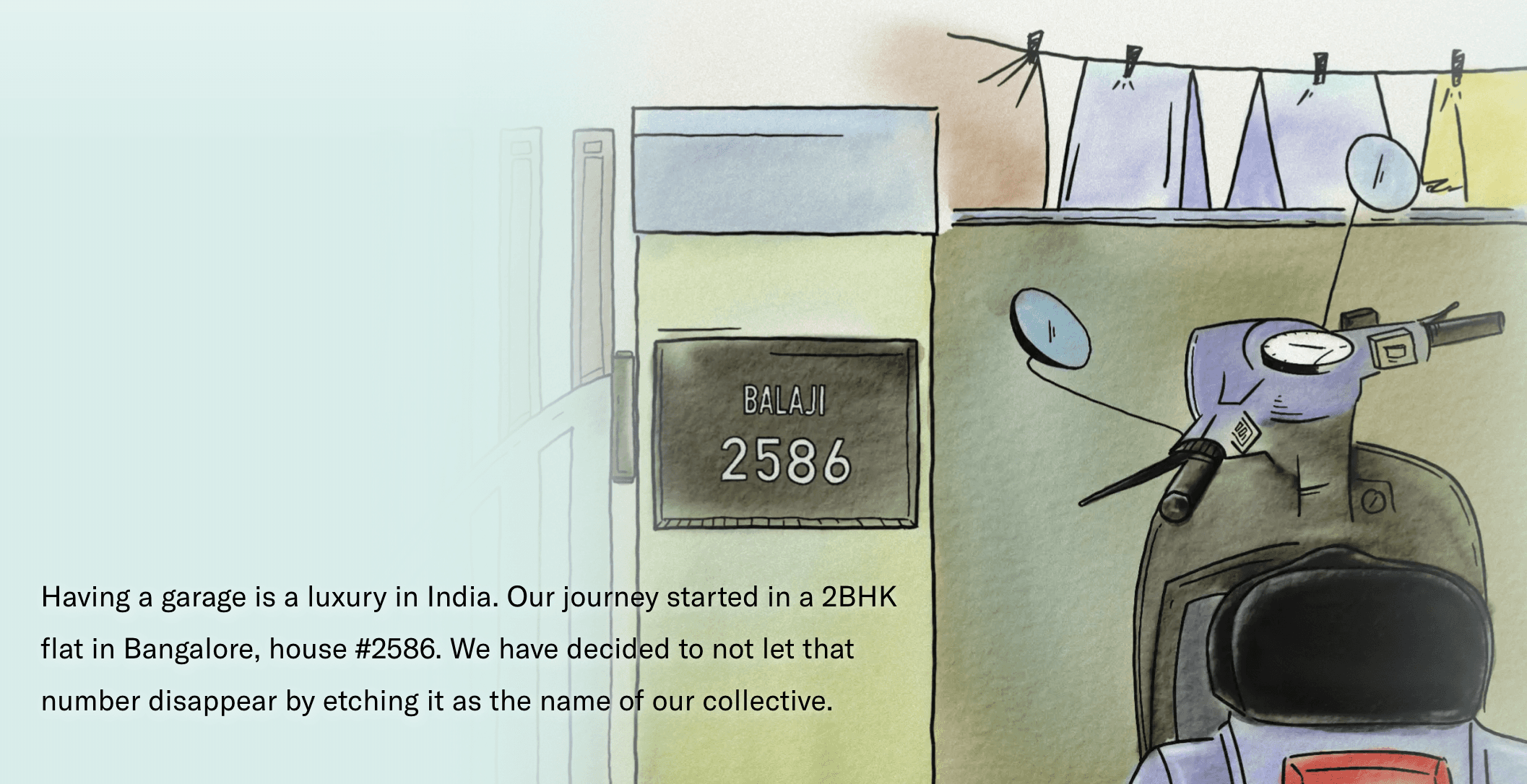
[ Updated on 2 Oct, 2024 ]